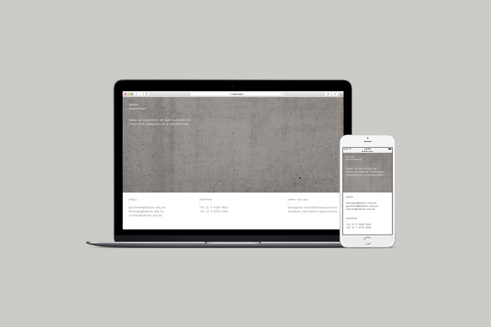
How to translate architectural parameters into graphic design language?
That is the question we asked ourselves in designing the brand identity for Leblon Arquitetura, a Rio de Janeiro based architecture firm.
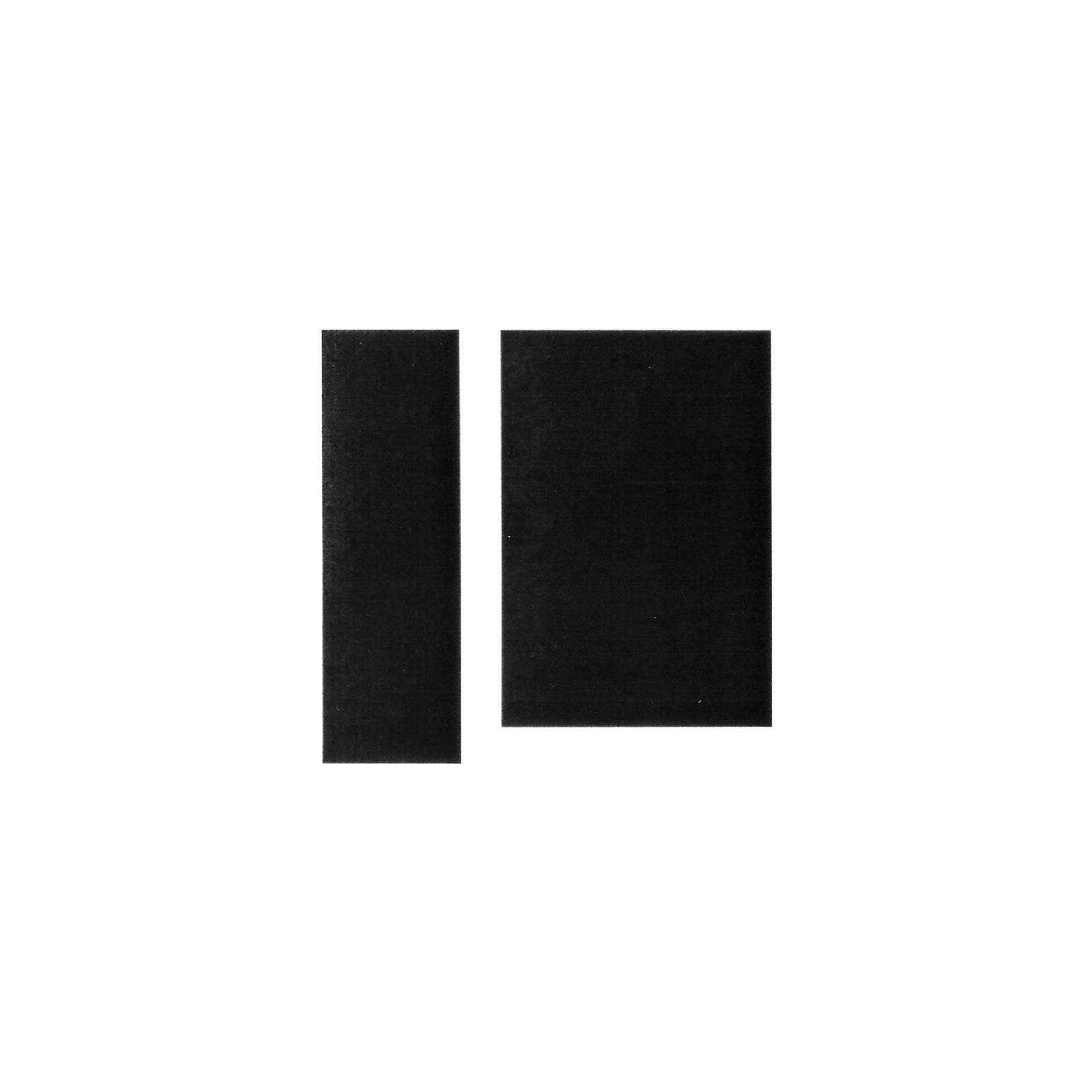
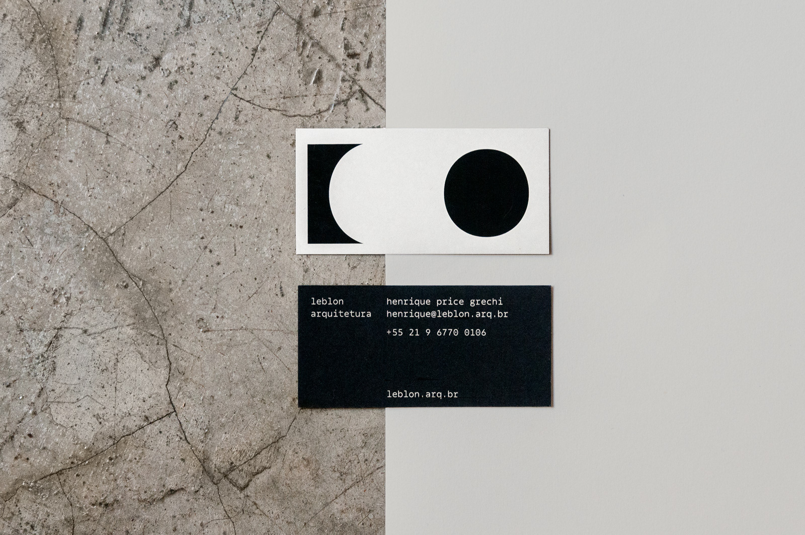
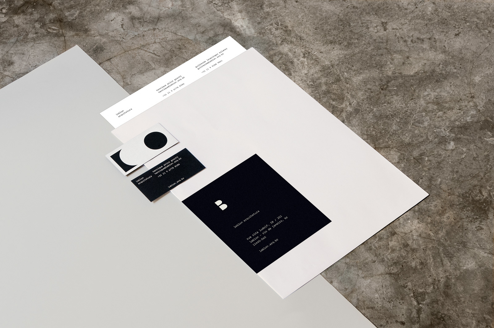
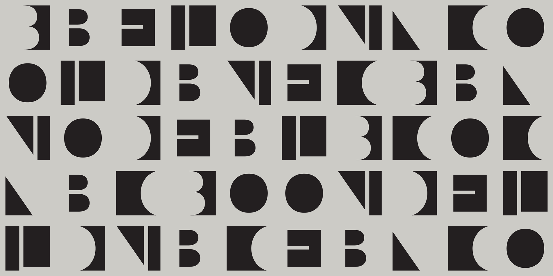
As a constant battle between dark and light, filled and empty, architecture and typography are a game of balance and form. This relationship became the basis for our solution.
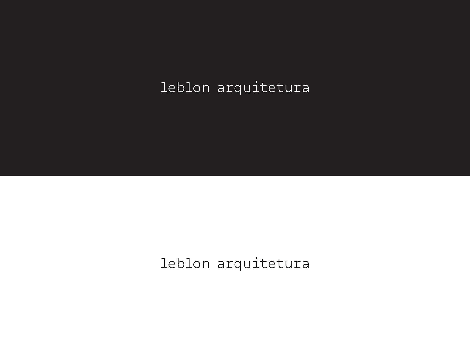
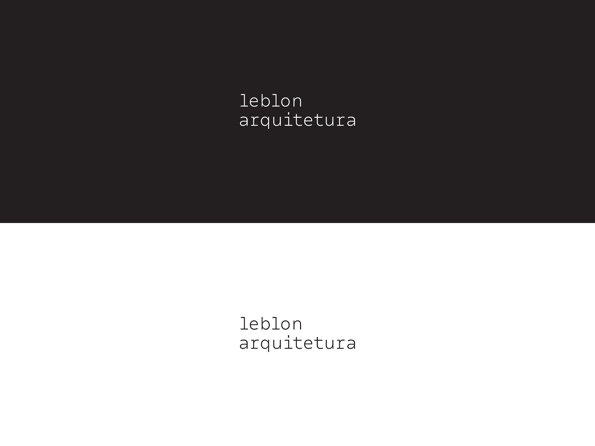
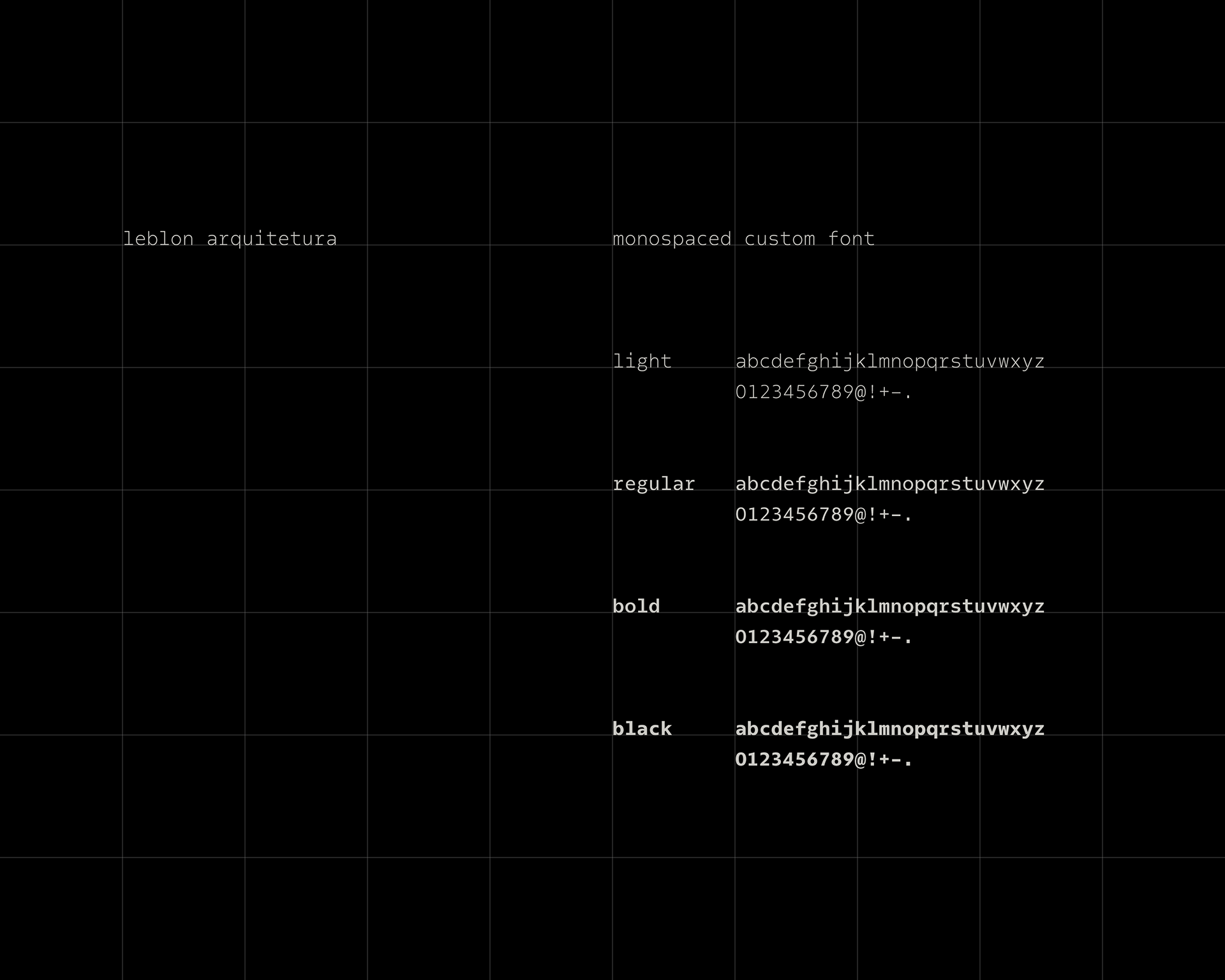
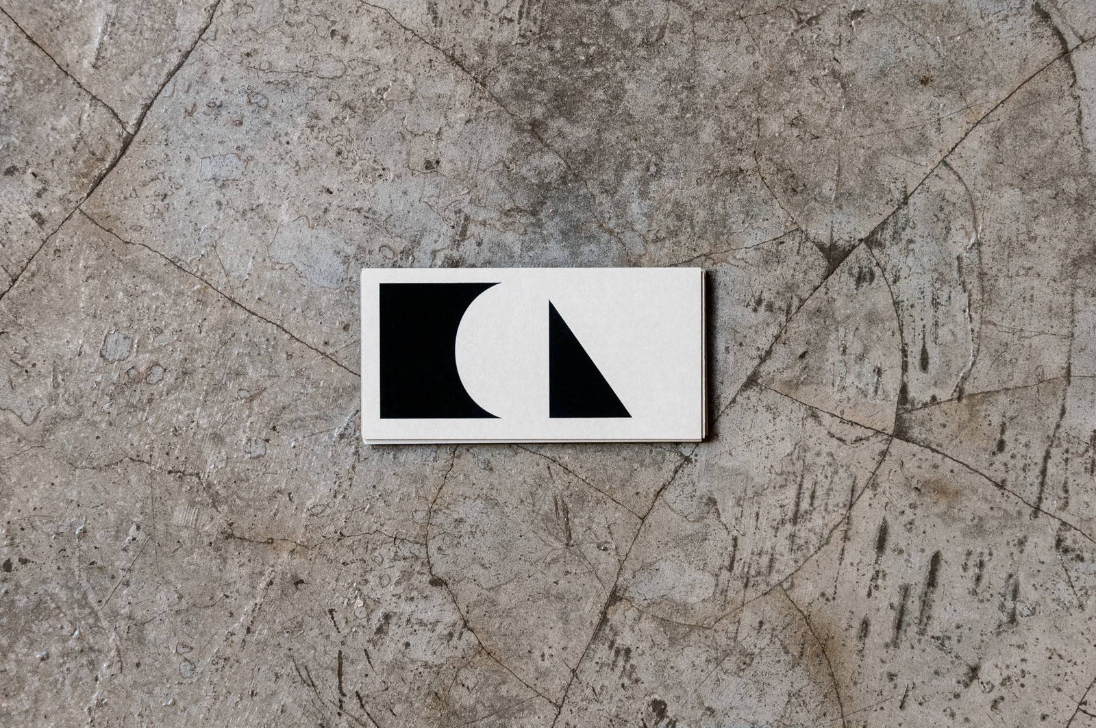
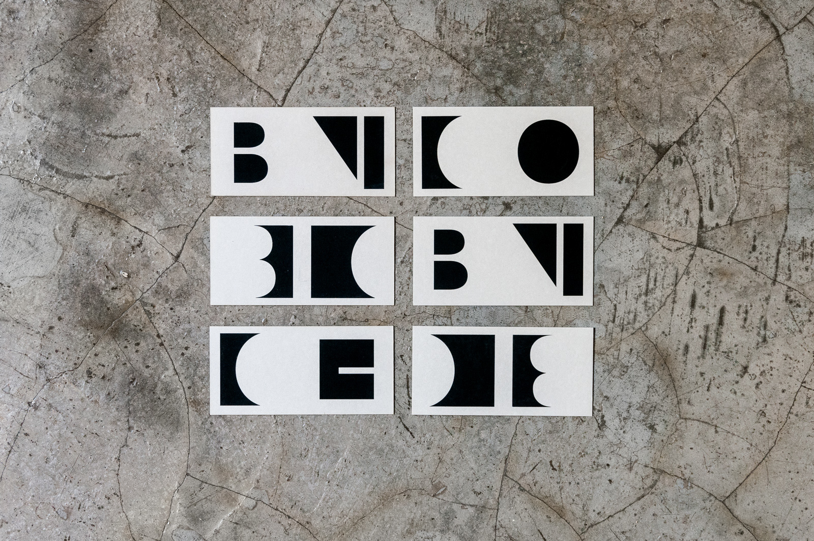
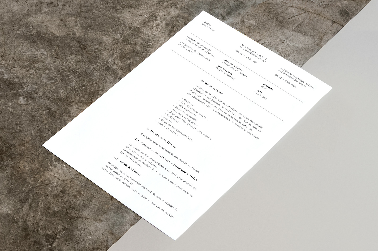
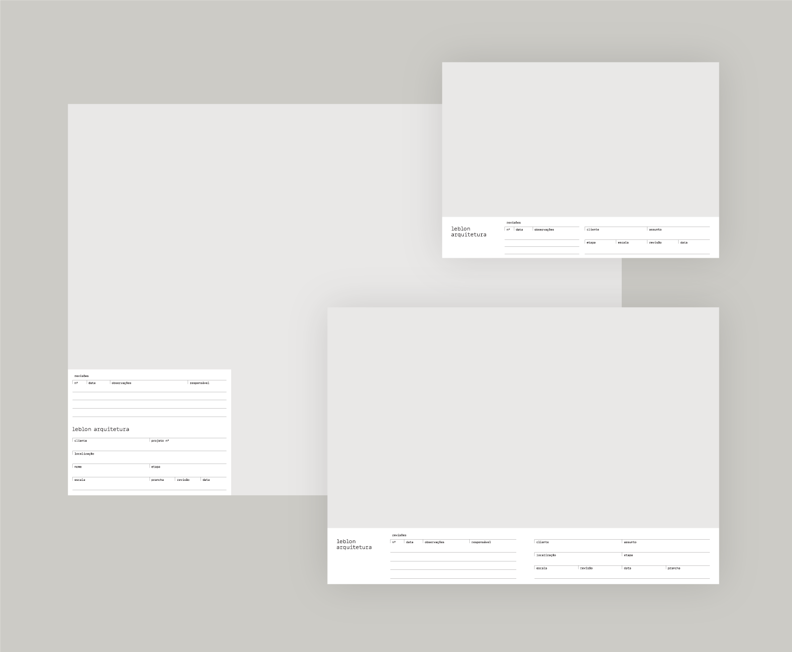
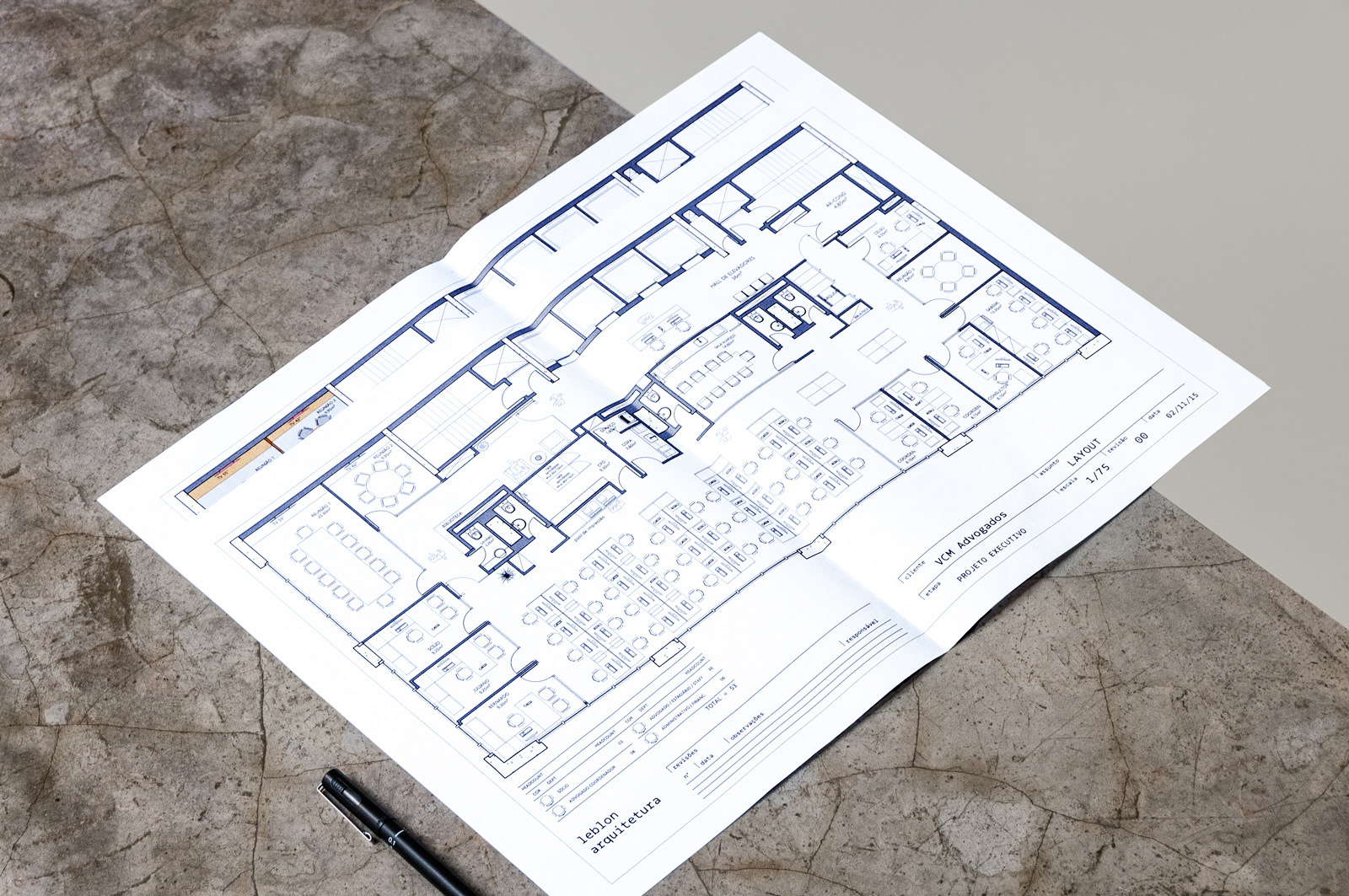
The counter forms (the empty areas of the letters) of the word “Leblon”, set in Avenir, were made into a system of interchangeable symbols to be used as avatars for digital and physical applications. We created a custom monospaced typeface – later released commercially as Odisseia – that provided structure and gave a rhythmic voice to all graphic communication by the firm.
Creative Direction
Rodrigo Saiani
Designers
Flora de Carvalho, Daniel Rocha, Dominique Kronemberger, Lucas Campoi, Rodrigo Saiani
Typeface Design
Rodrigo Saiani, Flora de Carvalho
Code
Rodrigo Saiani
Typeface
Odisseia